InSpirits Bar _
Logo, brand, visual language & everything that this catering business might need.
The Minionistas _
The creation of a viral phenomena.
BRANDING
CONCEPT
DESIGN
In Spirits Bar is a full beverage & finger-food catering service company. They offer a great variety of drinks, from coffee to cocktails, including healthy smoothies,
BRIEF
The client needs a brand identity that is elegant, charming, and playful. As they work in all kind of events, like fairs, workshops, or night parties, the brand needs to fit in every ocassion.

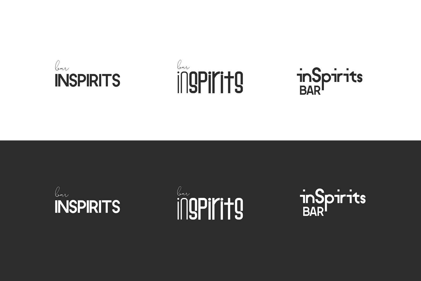
The identity has to be elegant, charming & playful, as the best cocktail masters.
The campaign reached more than 80 m people
I explored different logo visualizations, always looking for typefaces that look unique and playful.
Given the specific nature of this bar (as it's a mobile catering service and not a regular city location), they want to put more emphasis on the name than on the word "bar", This is why the designs evolved and moved the word to the end of the name (InSpirits Bar instead of Bar InSpirits),
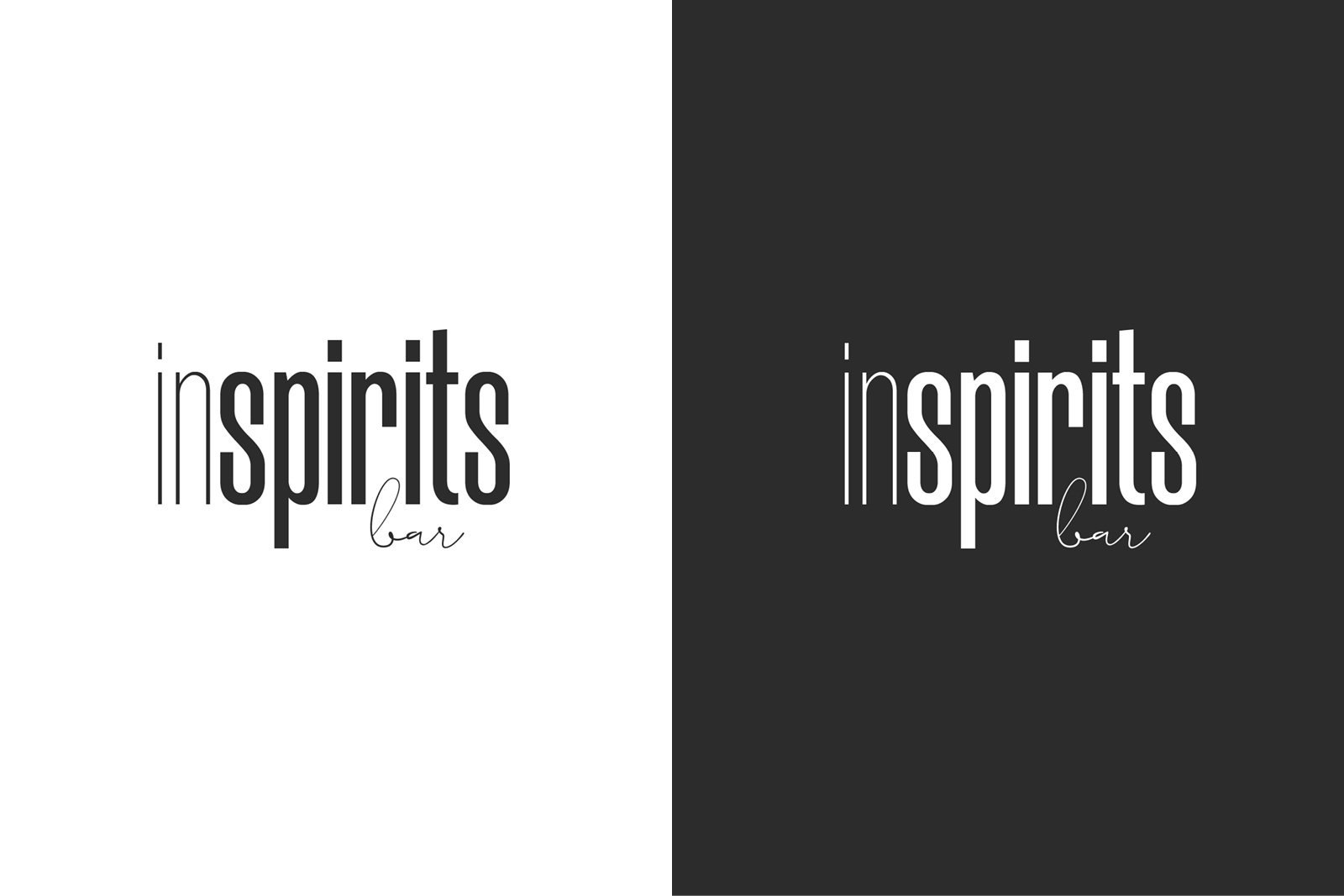
Always in.
The campaign reached more than 80 m people
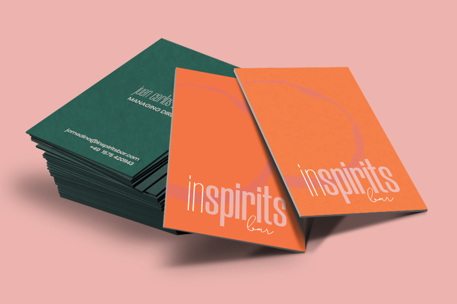
The final direction for the logo uses a high condensed typeface, in combination with the hand written font for bar, which is a small touch that brings the brand closer to its audience.
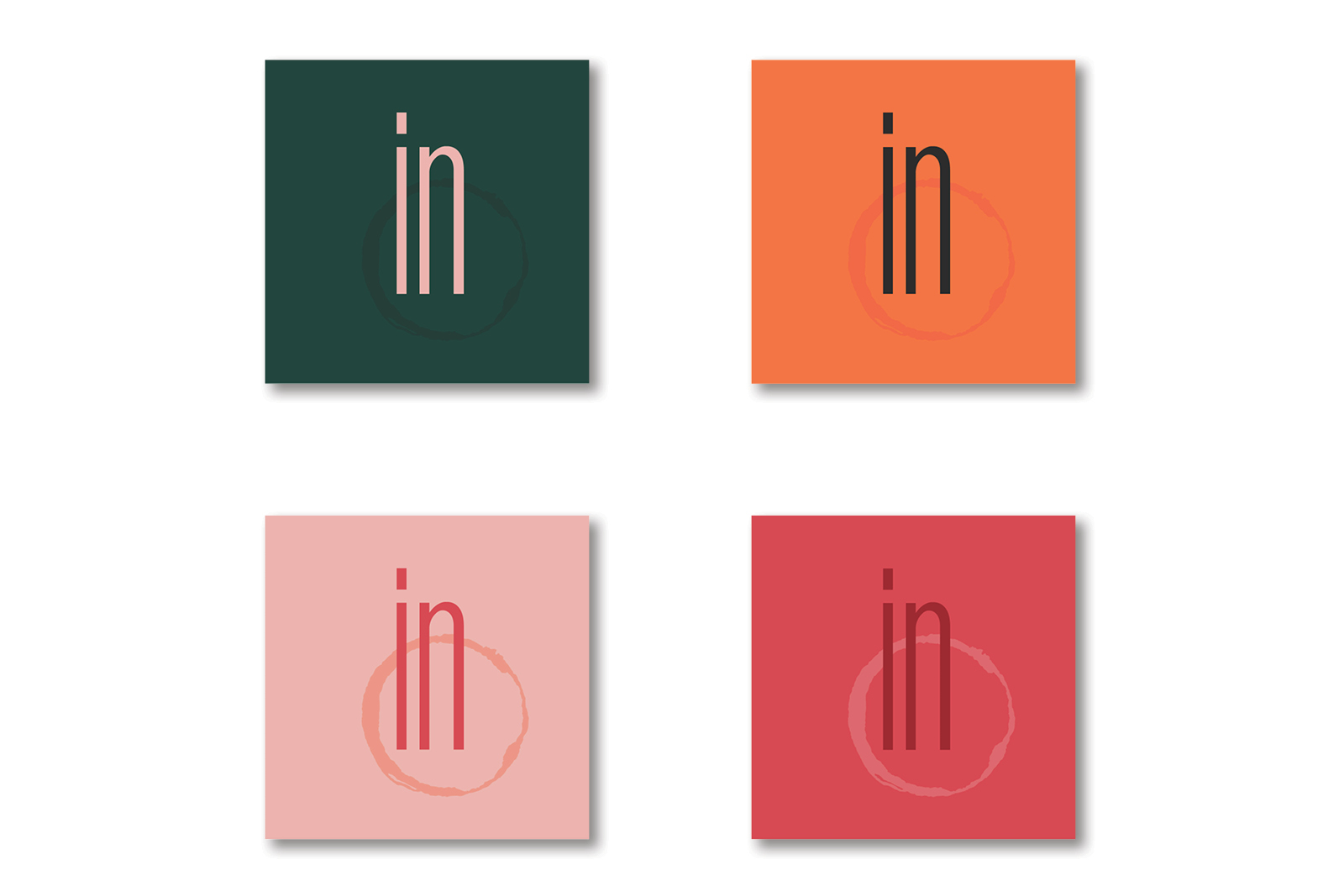
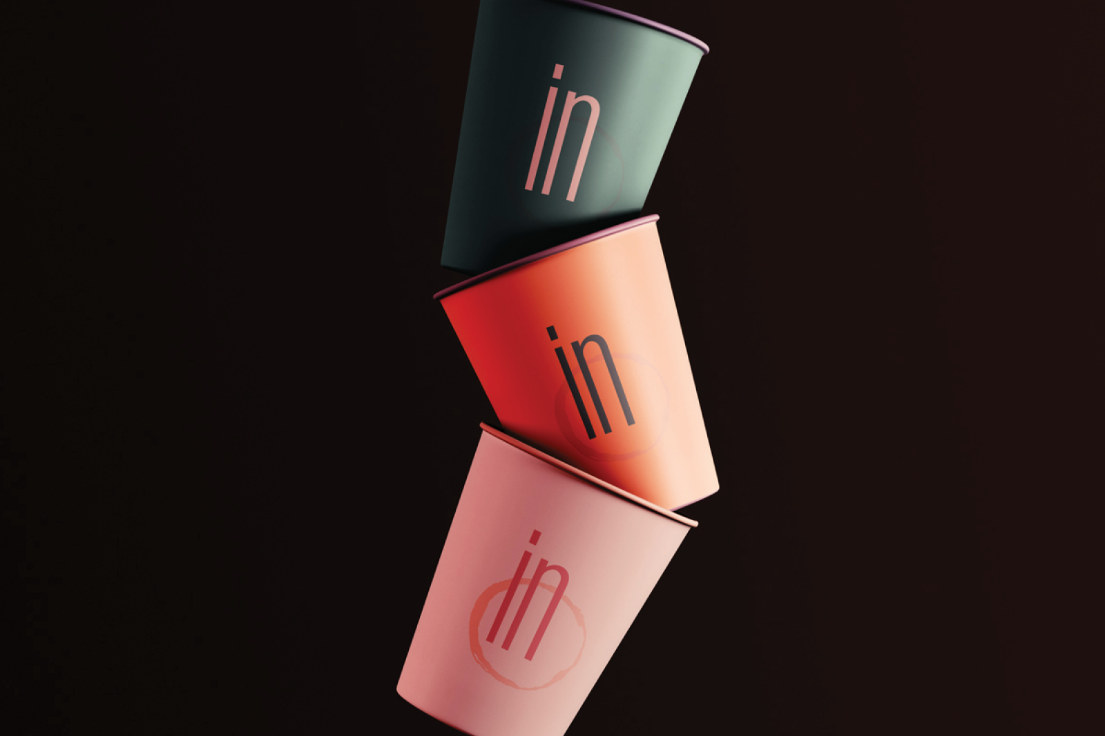
The change of weights serves the purpose to clearly separate the words "in" and "spirits", as the "in" will be reused conceptually later on for different applications.
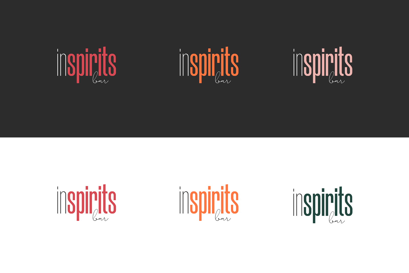
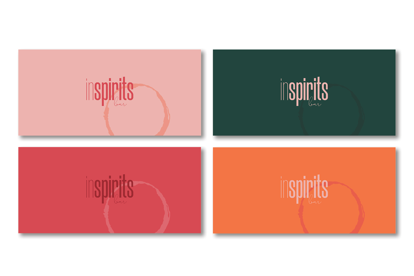
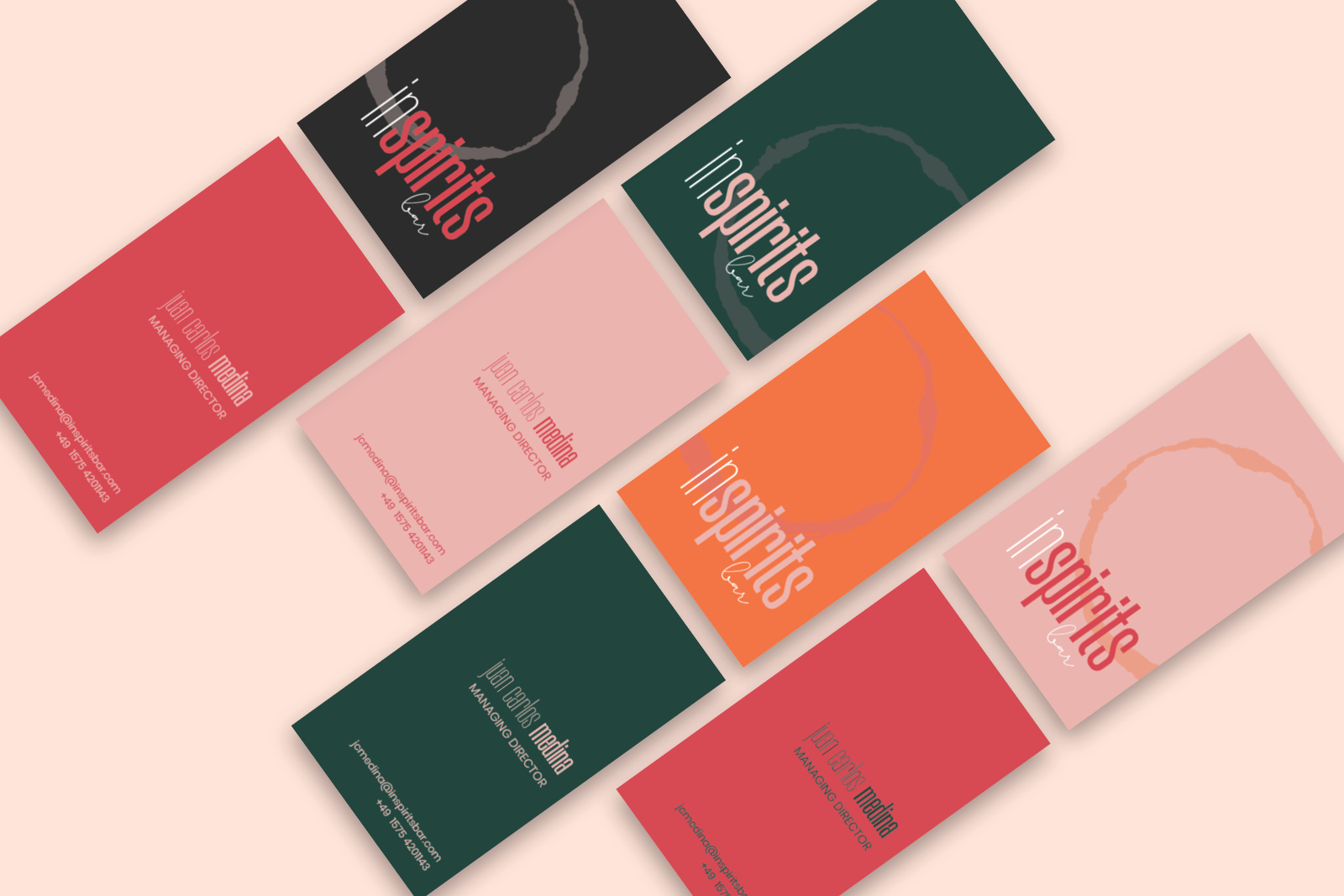
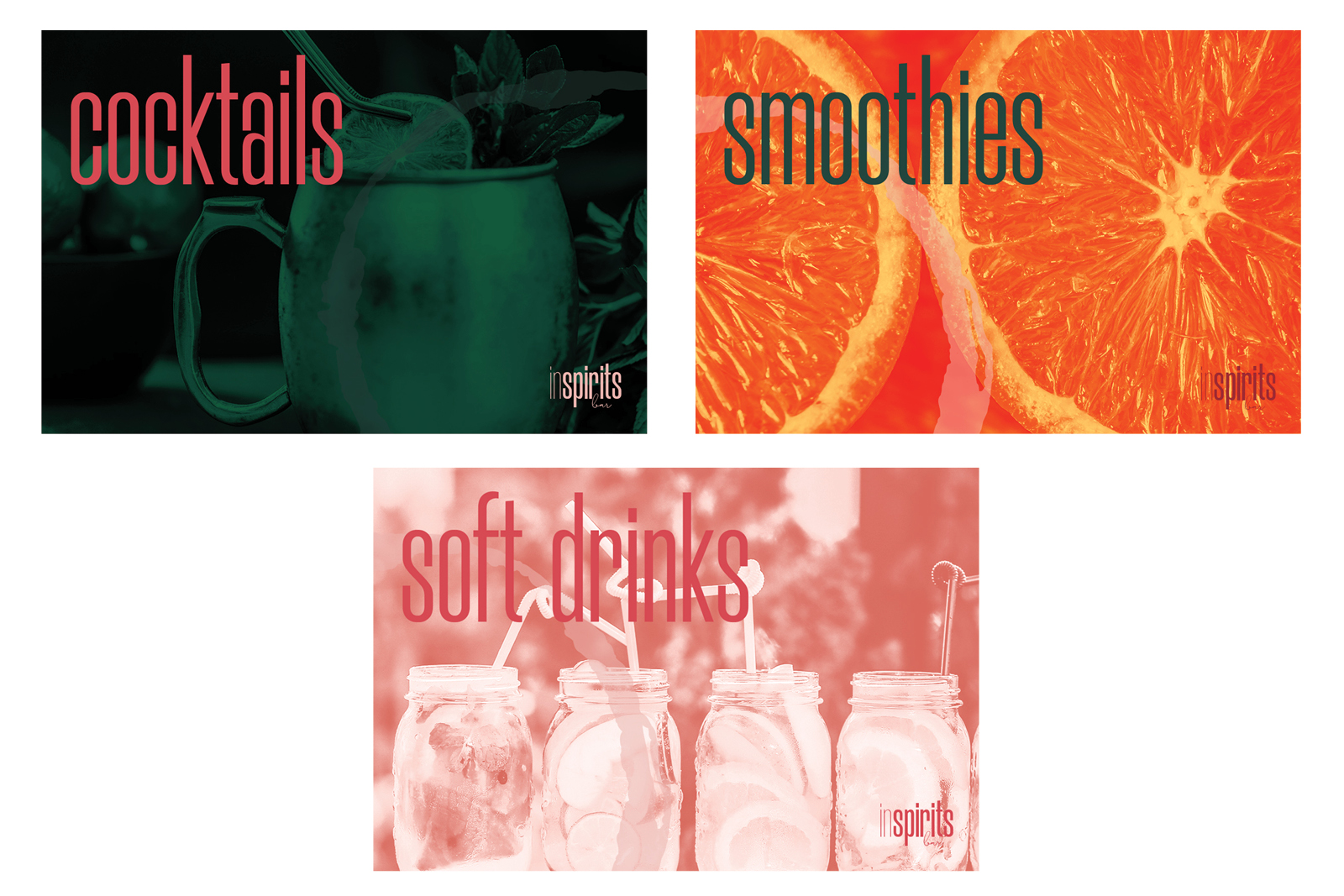
Yet with one unique voice, the diversity in the colour palette allows to speak different languages (from "let's party" to "I need a break from the conference").
The campaign reached more than 80 m people
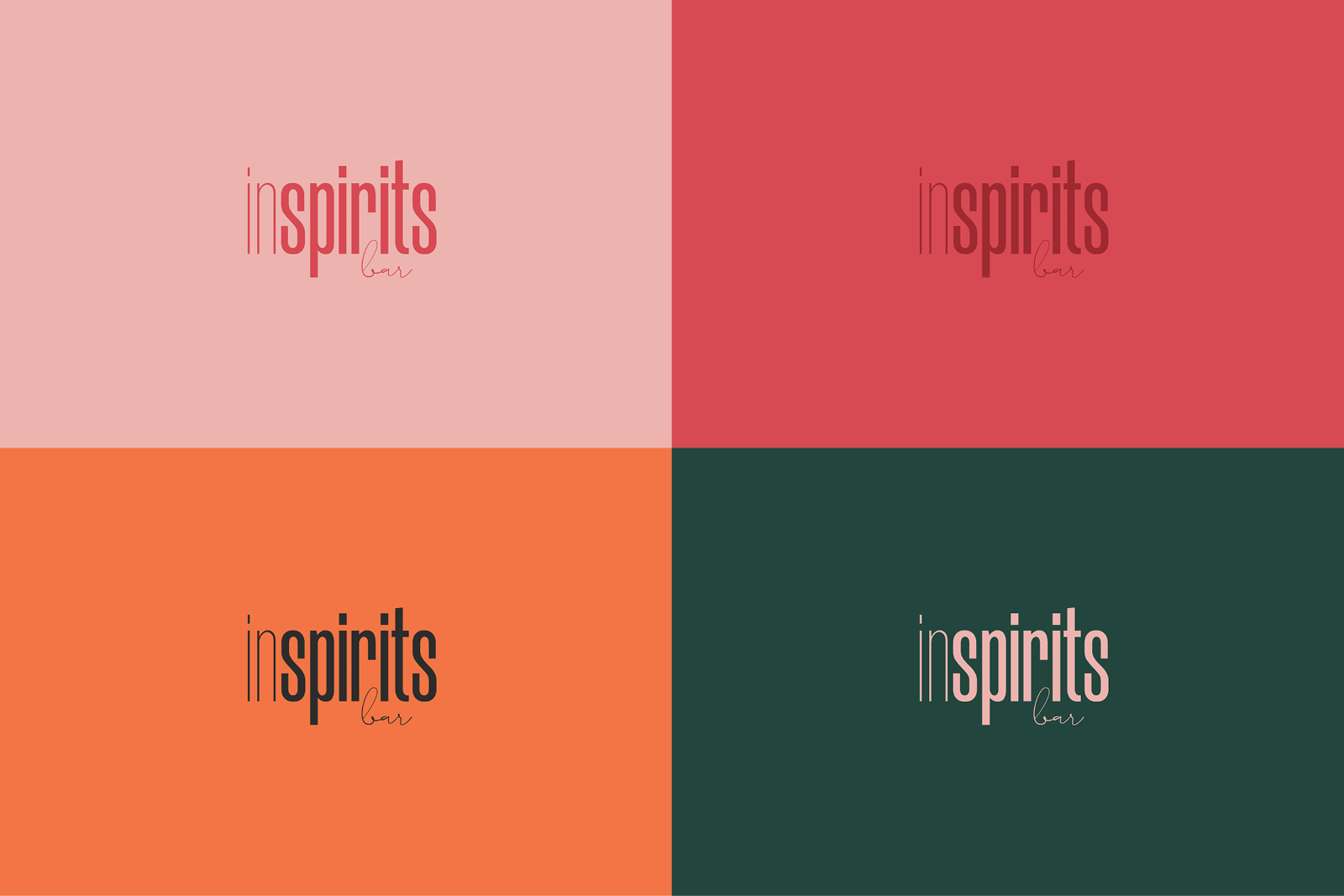
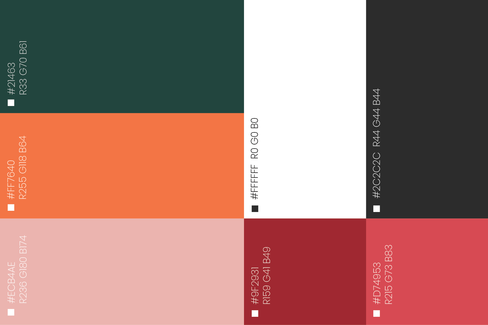
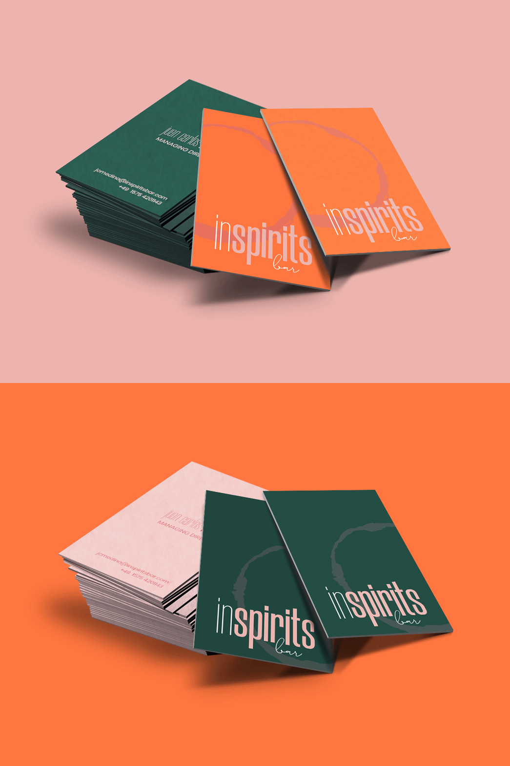
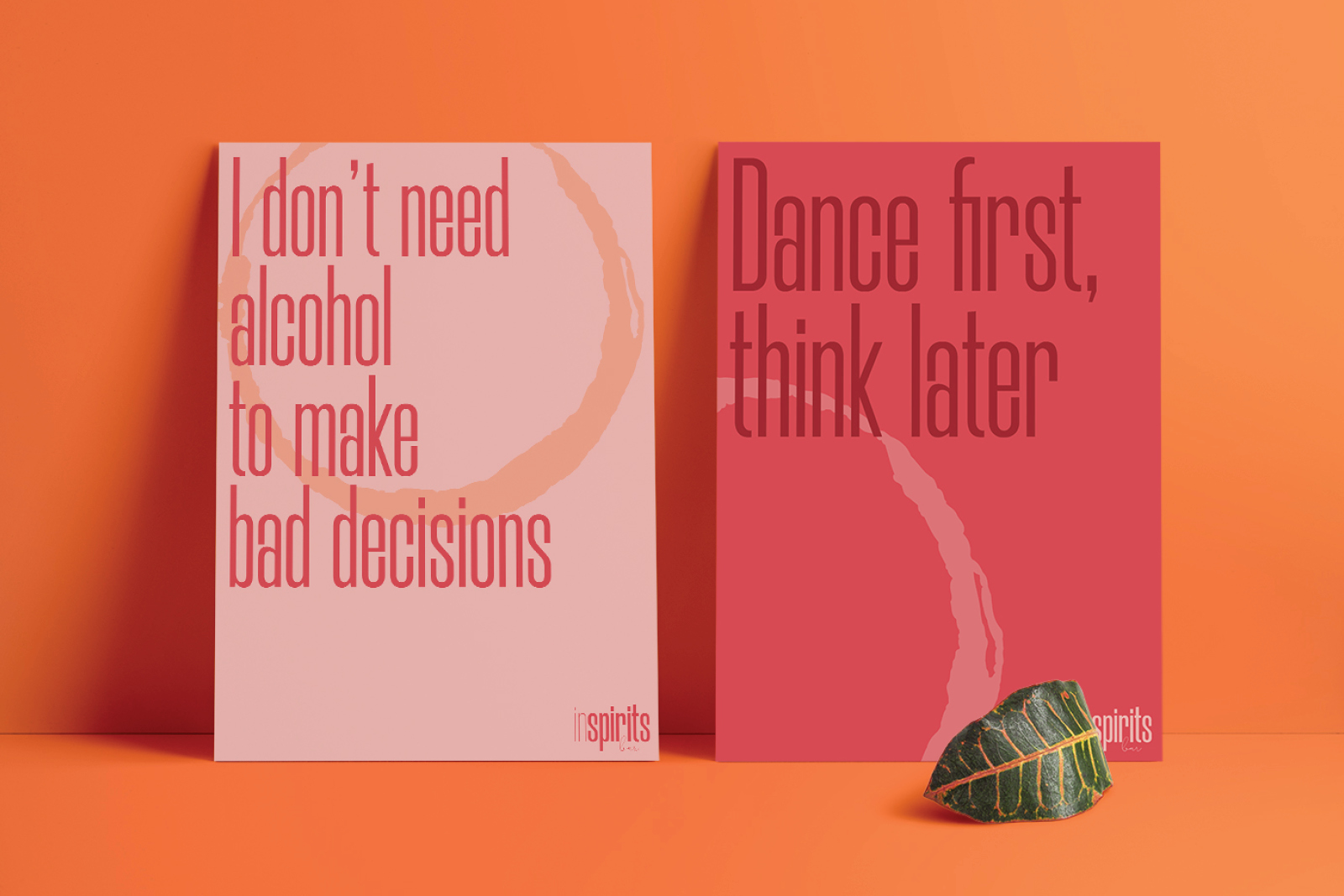
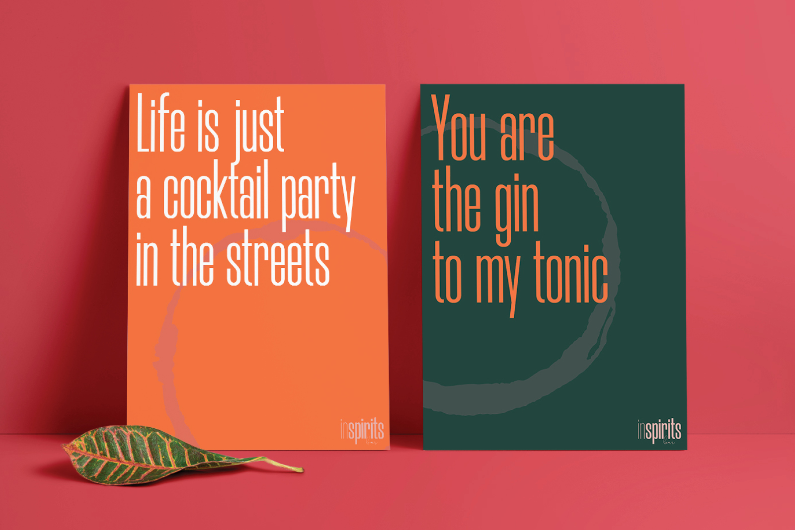
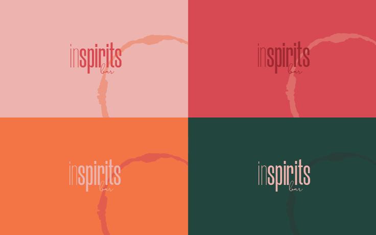
The color palette has been chosen having in mind the different uses of the brand in place. The possibilities with a dark background in combination with a lighter color (fresh orange or sweet rose) are designed for night events. where cocktails and dancing floors are protagonists. In contrast, the use of bright tones as a backgrounds (orange, the pinks) with a darker spark are simply perfect for day occasions: smoothies, coffees, and refreshing beverages.
All the colours have their favourite counterpart (green & orange, rose & pink...) but all of them can be combined together to create a flexible and unique voice for the brand.
COLOUR PALETTE
The color palette has 3 colours at its core (the solemn dark green, the vital orange, and the classy rose). Only this triad provides the brand with the versatility that is required to create different atmospheres, depending on the combination choices. The colour choice also contemplates some other highlight uses, in which the other secondary hues of red are a support.
TYPEFACE
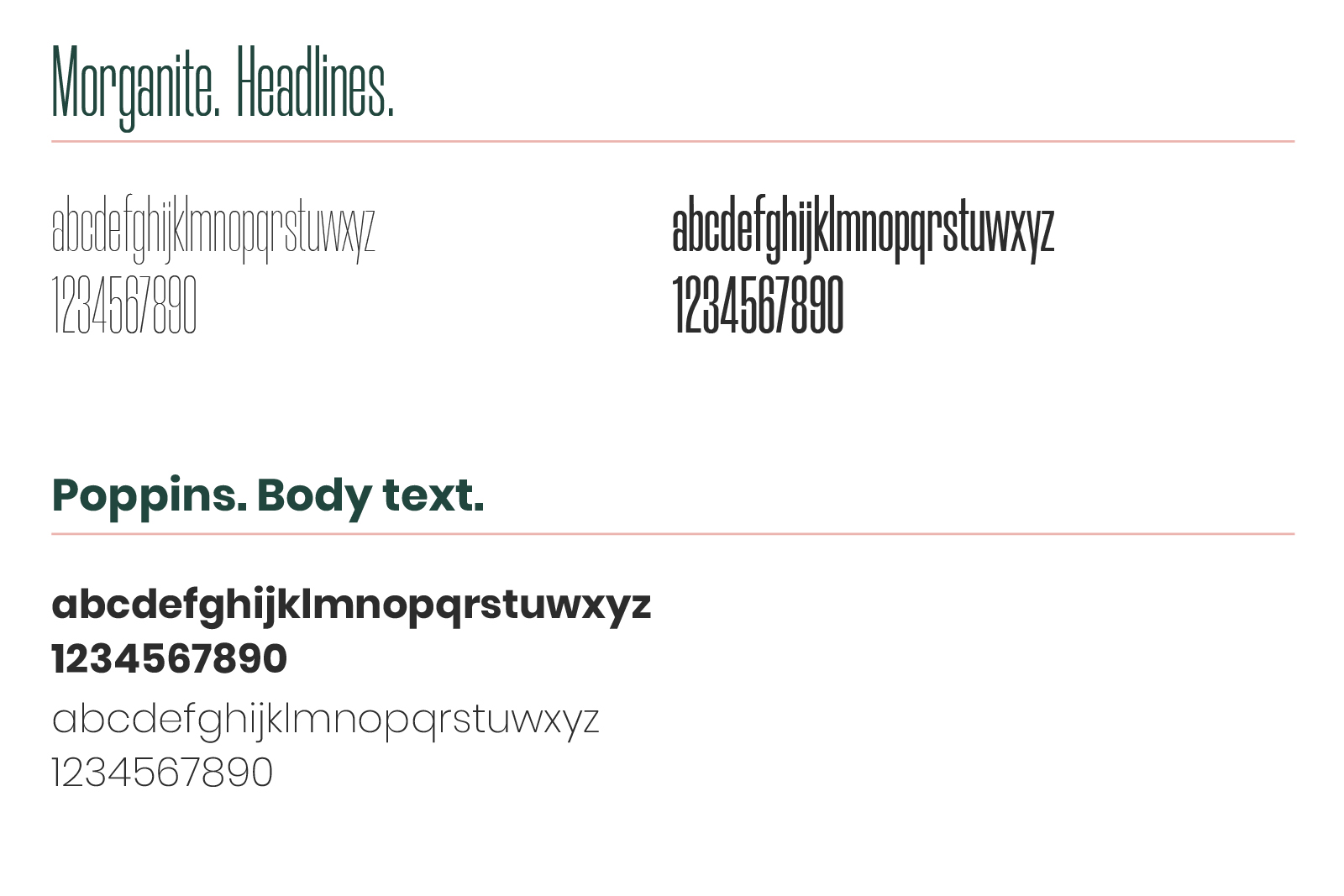
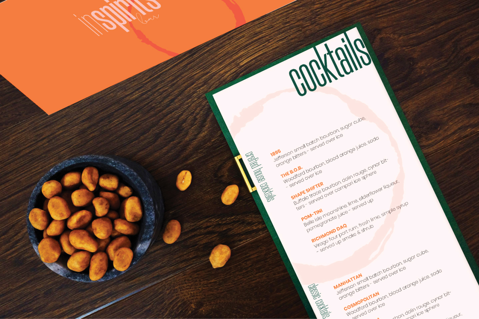
The condensed Morganiite looks always young and cool for headliines or short texts in posters. It creates a perfect contrast to Poppins, a readable, website font for all uses (website, menu, corporate applications, etc).

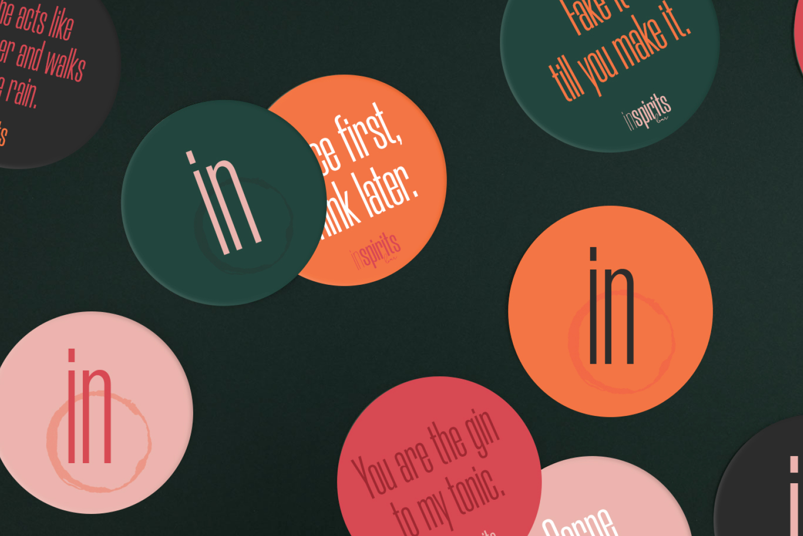
As unique as the memory that inSpirits Bar creates on its clients, the mark left by any glass on a surface is the core element that brings everything together.
The campaign reached more than 80 m people
After working on the logo, the colour palette, the typefaces, there was still something missing in the identity: an element that unified everything, a symbol that could represent the essence of the brand.
At first, the client had in mind a shiloutte of a cocktail glass to act as a visual symbol of InSpirits Bar. However, that is too specific for a brand that encompasses much wider range of beverages and services.
As the interaction of the people with the InSpirits Bar will contribute to create an experience to remember, I came closer to the idea of memorabilia, and therefore I developed a concept: the mark left by any kind of glass would become the trademark of InSpirits Bar.
On the one hand, every mark is different, as unique as the experiences of the clients with inSpirits Bar. But what they have in common is that both - the memory of the experience on the client's brain and the mark on the surface -remain afterwards.
On the other hand, no matter the glass -standard water glass, fancy cocktail glass, coffe mugs, you name it - they all have the ability to leave a mark on a surface. This is generic enough to encompass most of the services of the company, yet memorable in its meaning.
More projects
SketchesSketch I Typography
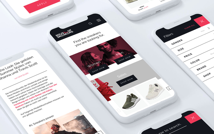
House of SneakersBranding I Interaction
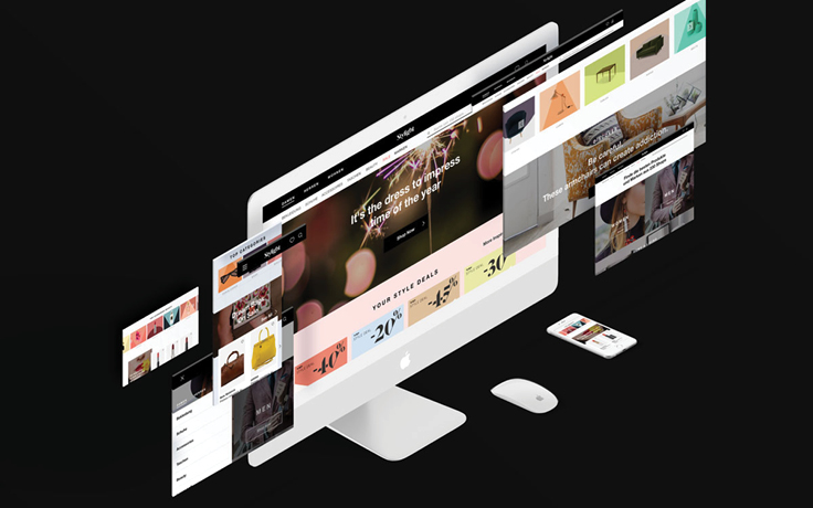
New navigation & homepageInteraction I Branding
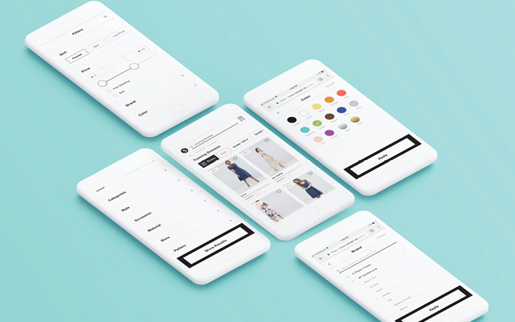
Filter UIInteraction I UI UX
Daho.am 2018Branding I Graphic Design I Interaction I Event
In Spirits BarBranding I Graphic Design I Interaction
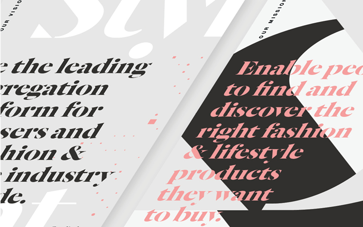
Stylight BrandingBranding I Print I Graphic Design
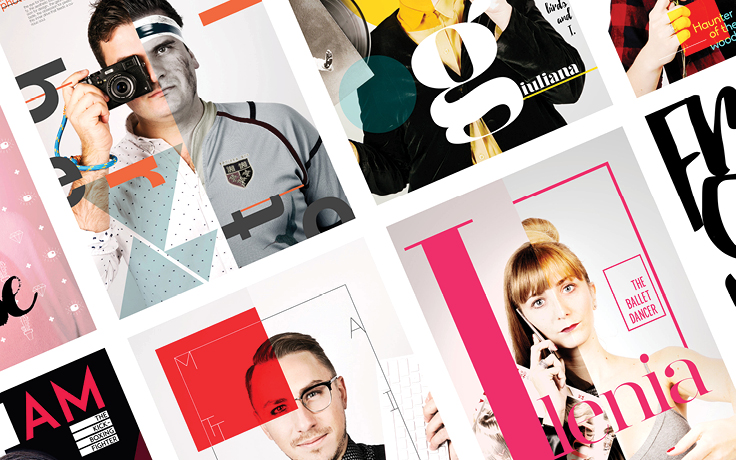
Two Sides_ Posters of identityArt Direction I Photography I Self-iniciated
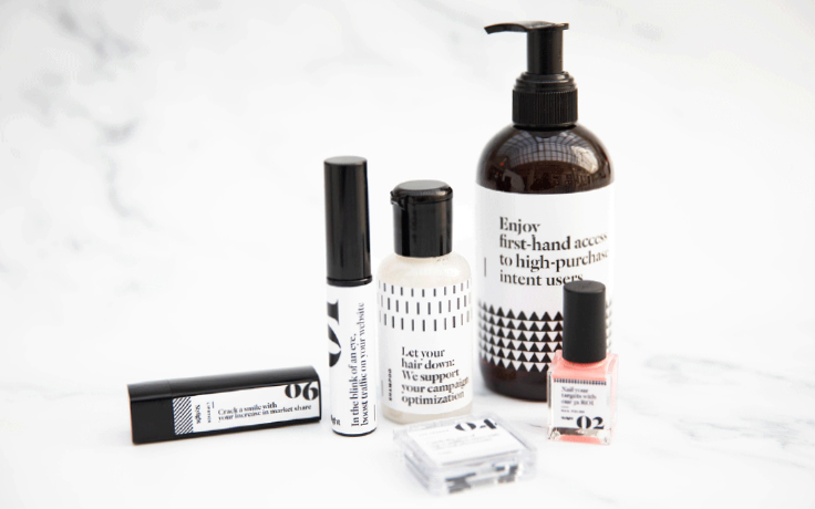
Packaging for a beauty setGraphic Design I Packaging
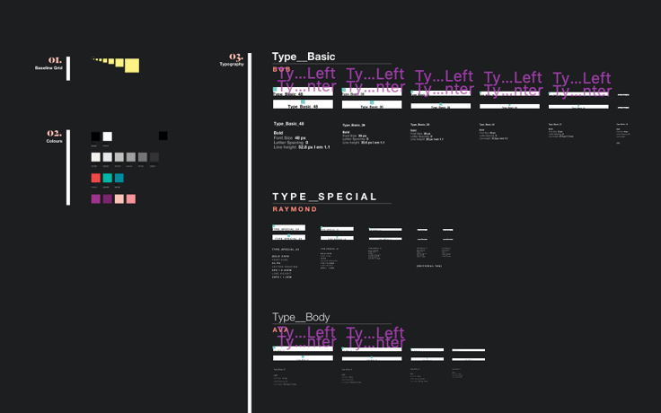
Design SystemUI UX
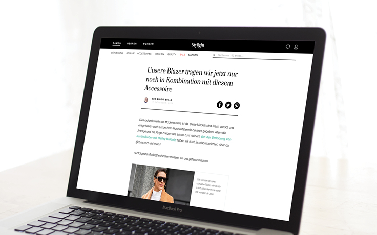
Magazine LayoutInteraction I UX UI
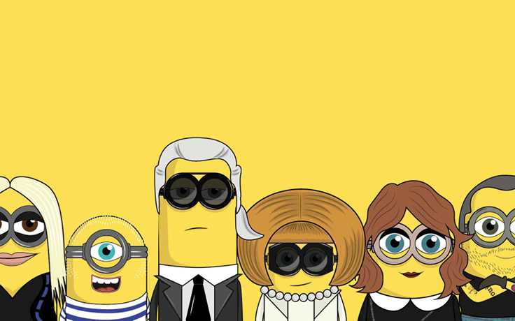
The MinionistasCampaign I Art Direction
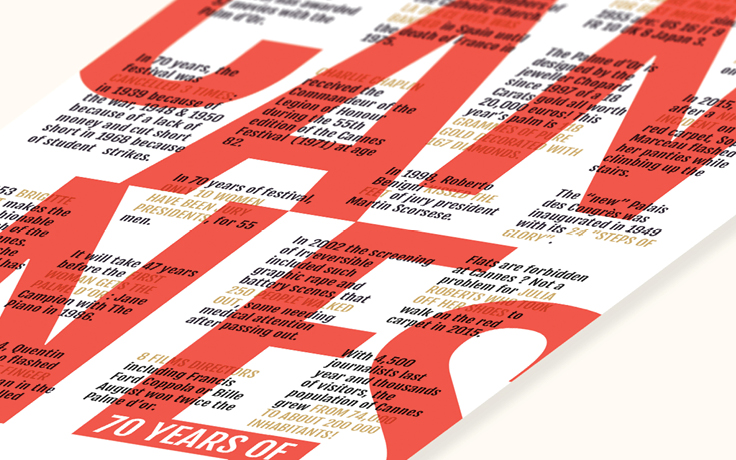
70 years of CannesTypography I Poster
Stylight AwardsEvent Branding I Website
Daho.am 2017Branding I Graphic Design I Interaction I Event
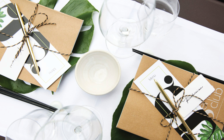
Genius ClubBranding I Event
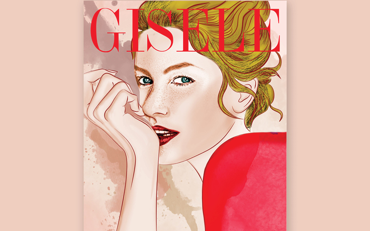
Gisele_ Her Life In CoversIllustration
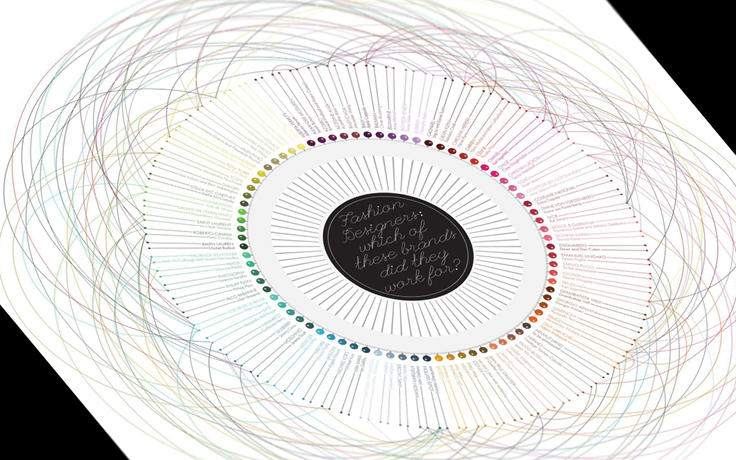
Fashion DesignersData Visualization
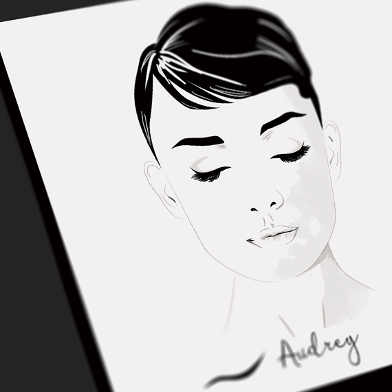
Iconic EyelinersIllustration
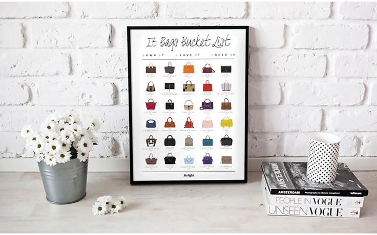
It Bags_ The bucket listIllustration I Poster Design
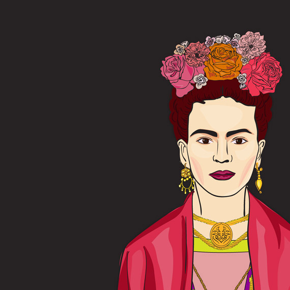
Frida KahloIllustration
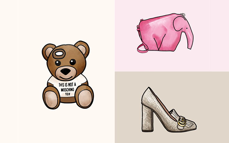
Fashion Weeks_ Starter PacksIllustration I Campaign
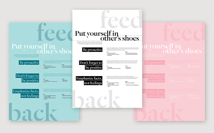
FeedbackGraphic Design
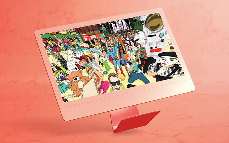
360 Map_ Celebrities in CoachellaArt Direction I Interaction
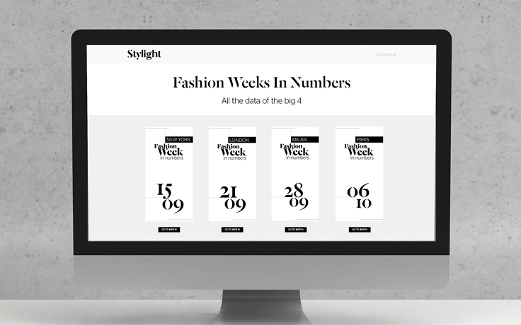
Fashion Weeks In NumbersGraphic Design I Interaction
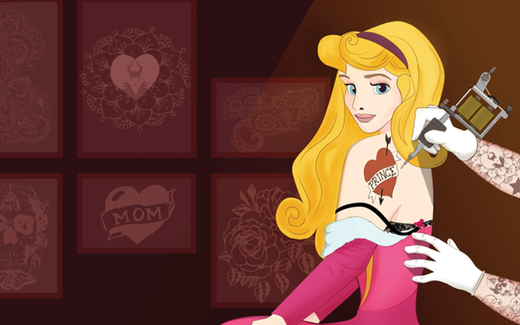
What do Disney Princesses do on Valentine's Day?Illustration I Campaign
Ink StopBranding I Graphic Design
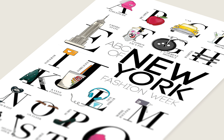
ABCs of Fashion WeeksGraphic Design I Interaction I Campaign
Intereuropean Human AidAnimation I Concept I Self iniciated
What is to grow upIllustration I Self-iniciated
Wall - DecorationArt Direction I Self-iniciated
21 things you can buy for the same price as an Apple watchCampaign I Icon Design I Infographic
Women of SeriesIllustration
